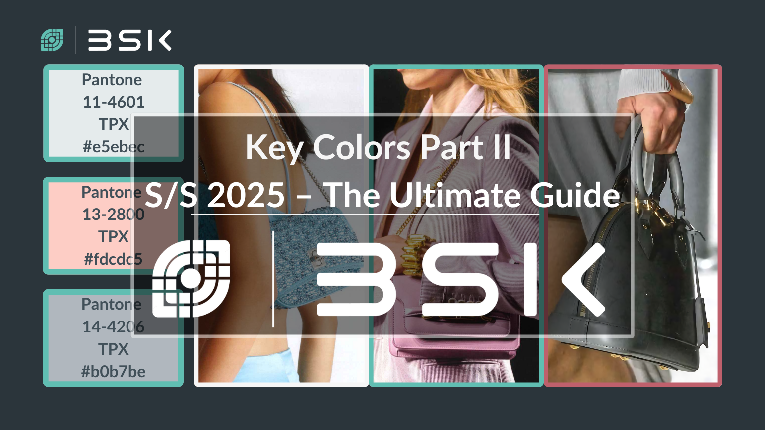
Key Colors S/S 2025 For Bags Part II – The Ultimate Guide. Step into the multicolor world of fashion colors, where trends shift like the seasons, and creativity knows no bounds. This continuation of our vibrant exploration into fashion’s chromatic future focuses on the palette set to define the upcoming seasons. Reflecting the pulse of the industry, influenced by runway spectacles, consumer whims, and cultural movements. Fashion colors form a vibrant tapestry of hues, shades, and tones. These colors inspire manufacturers and designers with their vivid style evolution, ranging from subtle pastels to bold declarations.
Navigating Changes
Exploring key colors in S/S 2025 bag design. This article serves as your compass, guiding you through the latest color trends. These are not just predictions but blueprints for creativity and innovation in the fashion industry. Uncovering the hues destined to captivate consumers and set the tone for a season of transformation and expression. In the previous key colors article, we divided them between key and highlighted colors. Here, we shall have a look at the key fashion colors. Explore their shifting landscape and influence on fashion, streets, and workplaces. Join us. Or if you, like me, from the comfort of my living room in my pajamas.

Key Fashion Color #1: Bit of Blue
In the fashion transition from autumn/winter to spring/summer 2025, the color Bit of Blue emerges as a key shade in the s/s 2025 key colors guide. This color represents freedom and transformation, a fresh start, and the essence of spring and summer with its gentle hue reminiscent of robin eggs.
This color also evokes memories of strolling along the beaches, finding pieces of sea glass—a treasure bestowed by the sea. Adding a touch of mystery and wonder to the narrative. Bit of Blue mirrors the soft, dreamy blue of winter mornings, transitioning into the serene atmosphere of warmer days with this key color. Aligning with the fresh feeling that comes with the thaw. Moreover, the elegance of aquamarine gemstones is encapsulated within this color. Reflecting the clear, calming waters of the ocean and a sense of tranquility and clarity to the designs for the upcoming seasons. Through its gentle yet profound essence, Bit of Blue is set to define the accessory trends of 2025, offering a smooth passage from the introspective seasons to the expressive bloom of spring and summer.
Embracing Tranquility
The color Bit of Blue offers versatility for many occasions with its soft, gentle hues. Perfect for casual outings, it adds a subtle freshness to everyday looks. Its tranquil and clear essence in professional settings brings a sophisticated touch to work attire. This color is ideal for beach and resort wear and complements the laid-back vibe of seaside escapades. Ah, Bit of Blue, transporting me to anywhere but here. Preferably a beach with endless margaritas, instead of just staring at these four living room walls. Who says fashion can’t be a vacation in itself? The bank manager, darling.
Additionally, it serves beautifully for special occasions like spring weddings or garden parties, enhancing outfits with elegance and grace. For travel, its representation of new beginnings and adventures makes it a fitting choice. At the same time, its everyday elegance ensures it pairs well with a wide range of colors and styles, making it a go-to accessory for introspective and expressive seasons.
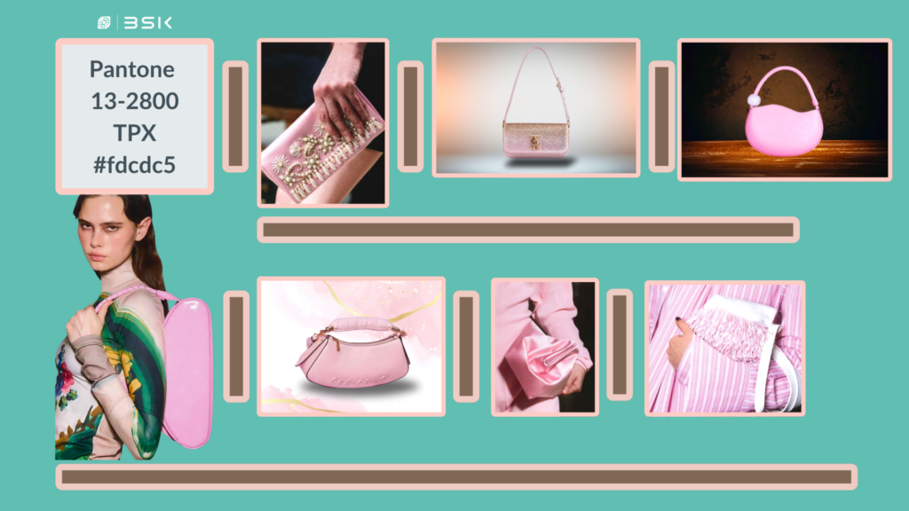
Key Fashion Color # 2: Pink Tulle
The second key fashion color in the ultimate guide is Pink Tulle. It is a captivating color for the spring and summer 2025 collections. It offers a refreshing contrast to the autumn and winter 2024/25’s Creole Pink. Pink Tulle, with its light and ethereal quality, evokes the delicate grace of ballet and the softness of dawn’s first light. This color promises renewal and gentle beginnings, reminiscent of the tender petals of cherry blossoms swaying in a serene breeze.
It’s like stepping into a peaceful Japanese garden, where an elegant lady in her ramie fabric kimono pauses by a koi pond, the gentle rustle of her garment mingling with the whisper of cherry blossoms. She turns, a soft smile playing on her lips in her elegant Asian accent, as if to say, “Welcome to the world of Pink Tulle, where fashion meets tranquility. Just kidding, go back to work, you dreamer!”.
It symbolizes a return to innocence and a soft embrace of one’s innermost dreams. While Creole Pink carried depth and warmth, perfect for the introspective and cozy moods of the colder months, its rich, earthy undertones spoke to comfort and nostalgia. It was a color that wrapped the wearer in the sophistication of vintage charm and the rustic beauty of autumn landscapes.
Embracing Lightness
In contrast, the key color, Pink Tulle, opens up possibilities for lightness and fluidity in fashion. It brings fresh air to the wardrobe, inviting light layers and flowing silhouettes. This color transcends the visual; it’s an experience, a mood that lifts and inspires. It’s particularly suited for the transformative energy of spring, representing a soft transition from the introspection of winter to the expressive and expansive nature of the warmer months.
Pink Tulle offers a versatile palette for designers, complementing bold and pastel counterparts. It adds a whisper of romance to casual wear, turning simple outfits into statements of subtle elegance. It brings a touch of personality and creativity in professional settings, standing out with its understated charm. For occasions like weddings and garden parties, Pink Tulle is unmatched in its ability to convey grace and sophistication, making it a favorite for those seeking a blend of modernity and timeless beauty.
Compared to Creole Pink, Pink Tulle is a beacon of lightness, encouraging a more expressive and open approach to fashion. Pink Tulle symbolizes a shift towards optimism, embodying hope and new beginnings. The spring and summer of 2025 will define renewal and joy. Plus, in the unlikely event of a marshmallow shortage, wearing Pink Tulle might make you the most popular person at the party—because who wouldn’t want to be seen with a walking, talking embodiment of everyone’s favorite fluffy treat?
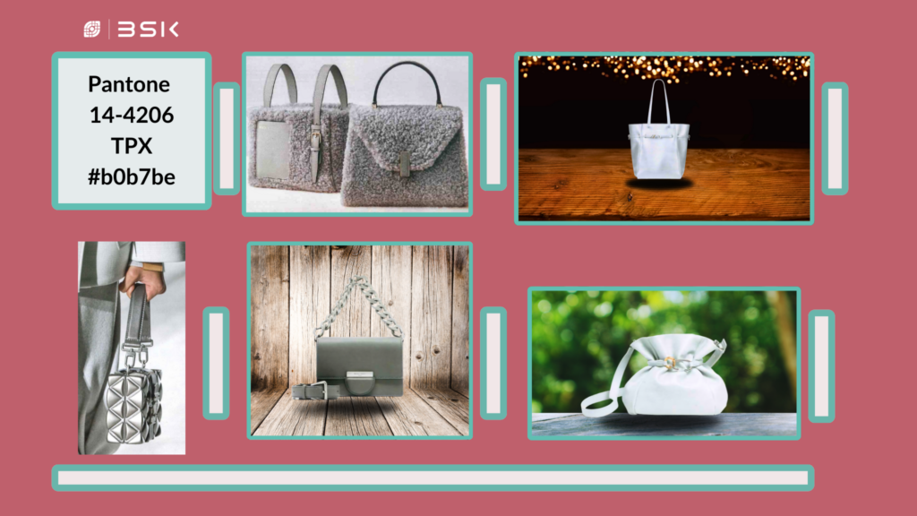
Key Fashion Color #3: Pearl Blue
The Ultimate Guide to the Last of our Key Colors for Bags Pearl Blue. is a distinguished color for the spring and summer 2025 collections. Presenting a serene yet striking contrast to the autumn and winter 2024/25’s Pastel Lilac. Pearl Blue captures a clear sky’s tranquility and the calm seas’ majestic beauty with its cool and refined essence. This color symbolizes clarity and composure, offering a sense of peace and a breath of fresh air. Pearl Blue reflects hope and promises new beginnings, like the calm after a storm. It exudes elegance and invites reflection and connection with the world.
In comparison, Pastel Lilac’s warm and inviting hue represents comfort and softness. Ideal for the reflective and intimate moments of colder seasons. Its subtle, soothing tones speak to the heart, evoking feelings of nostalgia and the comforting embrace of familiarity. Pastel Lilac is a color that wraps one in the gentle hug of a loved one and the cozy warmth of a well-loved blanket. Exuding the charm of quiet evenings and the tender touch of the first bloom of spring.
Renewal and Sophistication
However, Pearl Blue shifts the narrative towards openness and expansiveness. It encourages lightness in fabric and form, suggesting a wardrobe that breathes and moves freely with the wearer.
This color transcends visual appeal: it embodies a state of mind, an atmosphere of renewal, and boundless possibilities. Especially suited for the rejuvenating energy of spring, Pearl Blue represents a graceful transition from the inward focus of winter to the outward exploration of the warmer months. It offers a versatile palette for designers, pairing beautifully with vibrant and muted tones. It lends an air of refined sophistication to everyday wear, transforming simple ensembles into expressions of understated luxury. In professional settings, it stands out for its poised and collected vibe. At the same time, for occasions like beach weddings and seaside gatherings, Pearl Blue is unmatched in its ability to convey depth and serenity, becoming a choice for those pursuing an equilibrium between innovation and timeless elegance.
Conclusion
S/S’s key color palette, consisting of Bit of Blue, Pink Tulle, and Pearl Blue, is set to influence the bag manufacturing industry significantly. This trio of colors invites manufacturers and designers alike to delve into a vibrant color landscape, steering toward a future marked by renewal, optimism, and a celebration of soft, expressive beauty.
Incorporating these colors into your bag collections can open new avenues for creativity and market appeal. Pearl Blue, in particular, offers a sophisticated edge, providing depth and a touch of luxury that can elevate product lines to new heights. By embracing these colors, manufacturers can align with the upcoming fashion trends, ensuring their products resonate well with consumer desires and the overarching narratives of renewal and optimistic beauty that define the season. This harmonious blend of colors is not just a trend but a statement of intent, encouraging the exploration of expressive and emotive design in bag manufacturing.
Until next time. Stay colorful and keep the fashion vibes alive—because life’s too short for dull wardrobes and monotone dreams!